

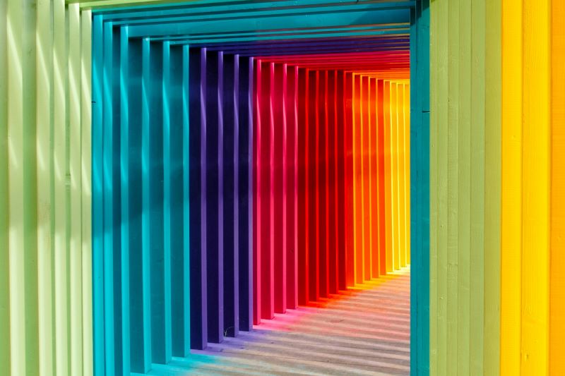
We all have our favourite colours. Believe it or not, colour can affect our mood. Remember how you were taught in school about cool and warm colours? In branding, colour does impact how your audience sees it.
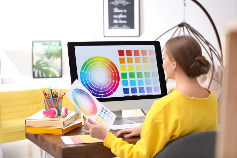
Colour has a psychological connection to our emotions, and this is now used as part of most influencer marketing campaigns. With the right colours, customers can trigger specific emotions that can influence their purchasing decisions. Knowing about colour psychology can help you develop your branding strategies to bring a positive impact to your business.
Another reason why colour psychology is important to business is because it helps your brand stand out. With the right colours, your social media posts and marketing materials can attract your audience, making them eager to learn more about your product or service. Choosing a colour to utilise can influence your brand’s reputation.
Here are some colour breakdowns and how they can impact your brand:
Blue
Did you know that blue is the world’s favourite colour? Almost half of men and women see blue as their top colour choice. This goes with most businesses as well. Blue is known to be the most popular logo colour, and it is used by 33% of top brands like Facebook and Twitter’s (now X) previous logo.
In colour psychology, apart from being a calming tone, it provides a feeling of security and trust. Maybe that’s why you fully trust Facebook for your details online. But if you’re in the food industry, blue may not be the best colour of choice as this colour can suppress our appetite.
Red
Another top choice in brand colours, red is known to evoke strong emotions such as power, energy, and excitement. The reason why most sale signs are in red is to emphasise some urgency to potential customers. Some use a softer shade of red to make it less aggressive.
On the negative side, red can represent violence or anger. In Disney’s Inside Out, the angry creature represents the colour red. But when used appropriately, red is a good brand colour. Just look at how Coca-Cola thrived for decades and is known for its red colour.
Yellow
Like the sunshine and smiley faces, yellow represents happiness and youthfulness. Happy Meals on McDonalds affirms the colour’s happy association with the brand. It expresses positivity and creativity. On the other hand, yellow can also cause fear or anxiety, so it is still best to be cautious about how you use this colour.
Black
Black is a staple colour that can be matched with any other colour. When creating your staple wardrobe, a little black dress is always on the list. It can make your brand look sophisticated and elegant, which is why many luxury brands choose black to refine their logos.
But black can also mean coldness and oppression. Some even see black as the emblem of evil, like how the villains in movies portray it. This colour could work effectively on luxury brands in fashion or tech but can provide a negative impact when used in the health industry.
White
And speaking of the health industry, the colour white can be the best fit for healthcare companies as this brings a clean appeal to your brands. Nowadays, white is directly associated with minimalism and is used in most minimalist-inspired homes. It provides a sense of independence and simplicity for brands as well.
Green
When nature is mentioned, we often think of the colour green. Health and fitness companies incorporate the use of green in their branding colours. It also signifies growth, freshness, and prosperity. Negatively, it can mean immaturity and materialism, so choosing the right shade of green for your brand is crucial.
In choosing a brand colour, it is always important to know its meaning and how it is relevant to your niche. Choose a colour that feels authentic and the most connected to your company. You don’t just choose a colour because it is your favourite. You choose one that suits your brand.
Try to fit in your audience’s shoes as well and see how they will perceive your brand based on colour options. Know what emotions you will evoke through your colour palette. Lastly, choose a colour that will allow you to stand out among your competitors. This will help you set apart and may bring on more opportunities to be more recognisable by your target market.
You may also like: The Difference Between Logo Design and Brand Identity